Background
Japanese.io is the project of the Atilika company. The company specializes in natural language processing, and Japanese.io is a sub-product of the company’s advancements in processing Japanese.
The product needed a face, so I was tasked with developing its logo, style, and user experience. First as a freelancer and then as a full-time employee.
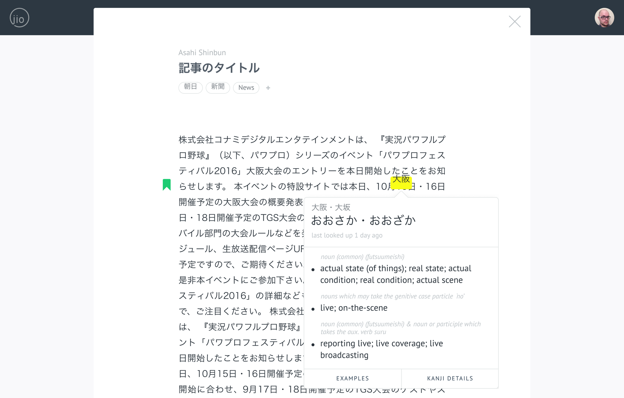
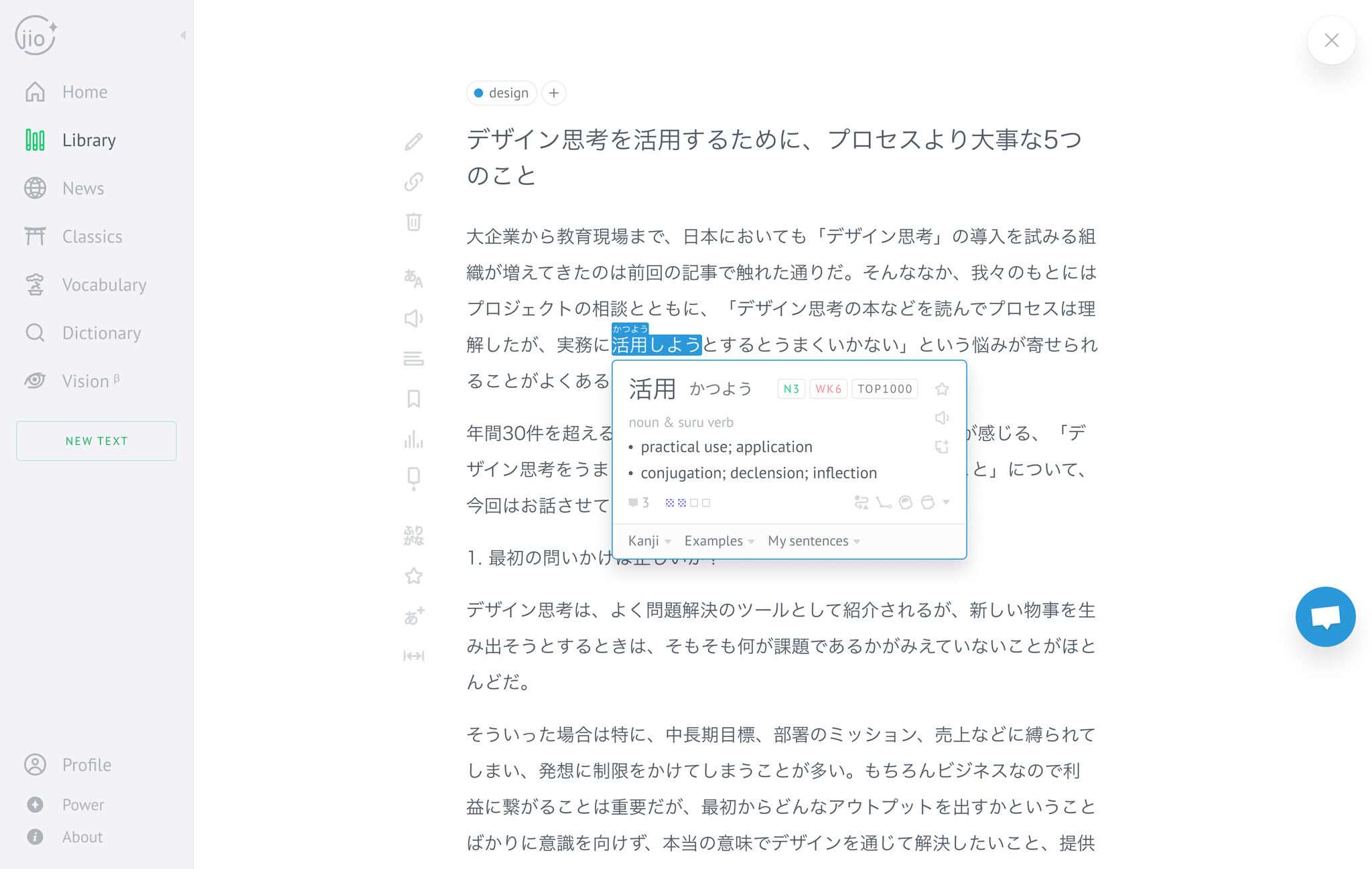
At first, Japanese.io was built to solve a very specific problem for Japanese learners: looking up unknown vocabulary while reading Japanese is inconvenient and bulky. People had to keep several tabs open at once and constantly switch between them. Japanese.io processed Japanese text and allowed users to look up individual words with a single click. Later, Japanese.io evolved into the full language learning service it is today.
Process
Japanese.io is based on the vision and experience of the founders. Both of them learned Japanese and understood how hard and inefficient it often is. Consequently, for a long time, they were the main source of information.
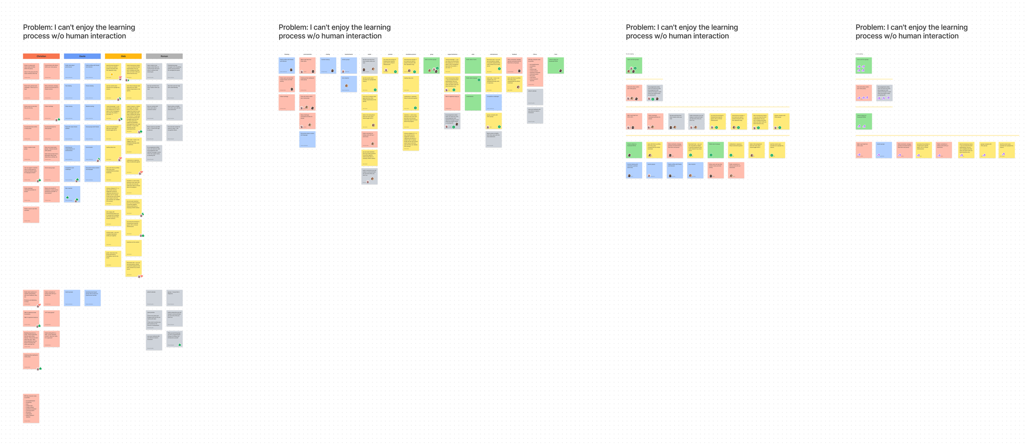
In 2021, I started researching the core topic — learning Japanese. In total, I conducted 60 interviews with Japanese learners.
At first, the focus was to identify the problem preventing people from mastering Japanese. Findings showed that the main reason was the lack of motivation. Learning Japanese takes a long time, and it is very hard for people to maintain the necessary focus for so long.
Further interviews revealed a few things that kept people motivated: the sense of improvement and human interaction.
Solution idea #1: Human Interaction
Together with the founders, we brainstormed possible solutions to the “human interaction” problem. How could we incorporate human interaction into the product? After a few discussion sessions, we chose the idea of a “book club”.
The idea was to transform the main Home page into a hub where users could choose a book at their level, read it, and then discuss it. To ensure all participants get at least some human interaction, we also added the ability to contact “mentors” - team members who were on the lookout for any questions.
The goal was to keep costs as low as possible, so we had to fake some features (e.g., participant avatars) and use existing solutions for others (e.g., a Discord server for communicating with readers).
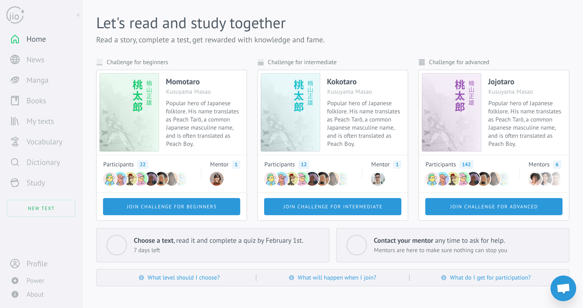
The first version of the UI was considered too overloaded with information and difficult to understand.
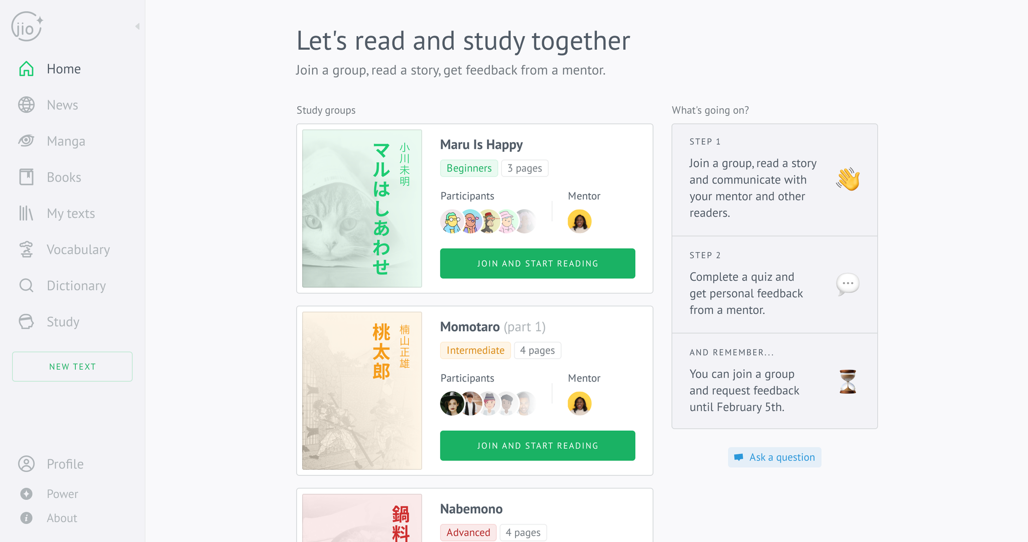
The second version was stripped of all unnecessary elements, with the focus on book covers and participant avatars.
Solution idea #2: Sense of Improvement
Sense of Improvement was our second bet. Again, we brainstormed solution ideas and created a user persona based on interview data.
We came up with a lot of ideas and chose three:
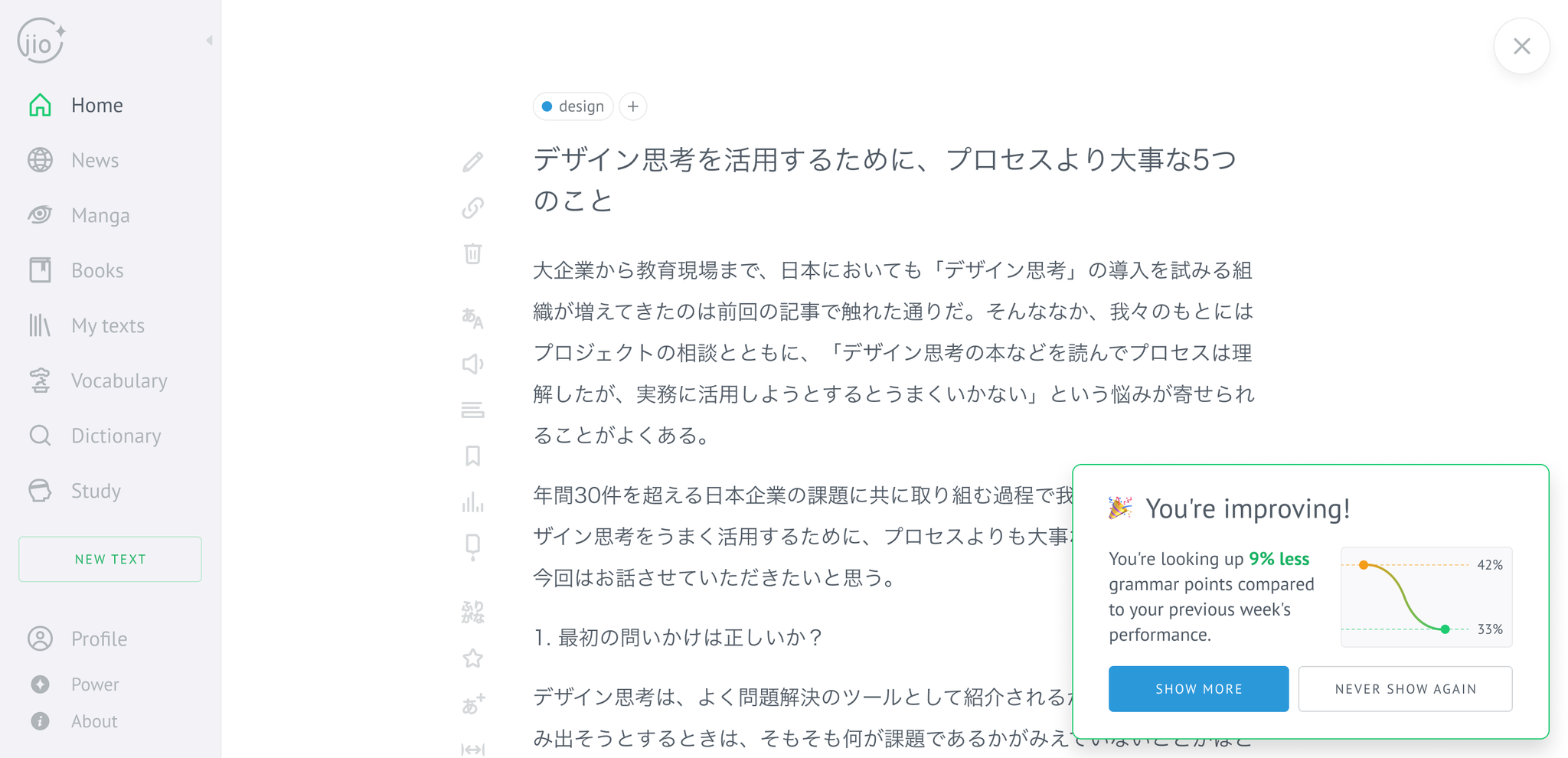
Positive changes — find even the slightest improvements in the user’s reading performance and inform them about it.
Custom texts — automatically write text using GPT-3 based on the words the user learns in the app.
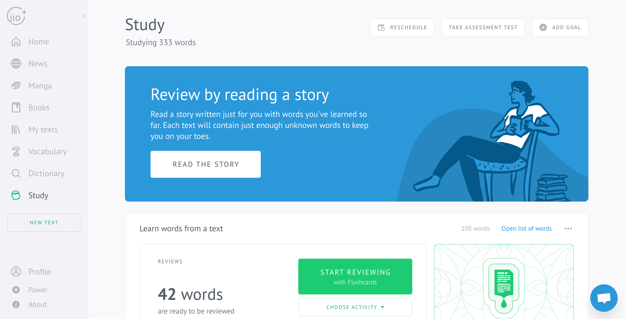
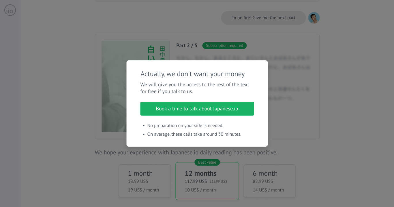
Guided daily reading — instead of leaving users by themselves with a text, Japanese.io will guide them step-by-step, suggesting to look up unknown words, explaining grammar, etc.
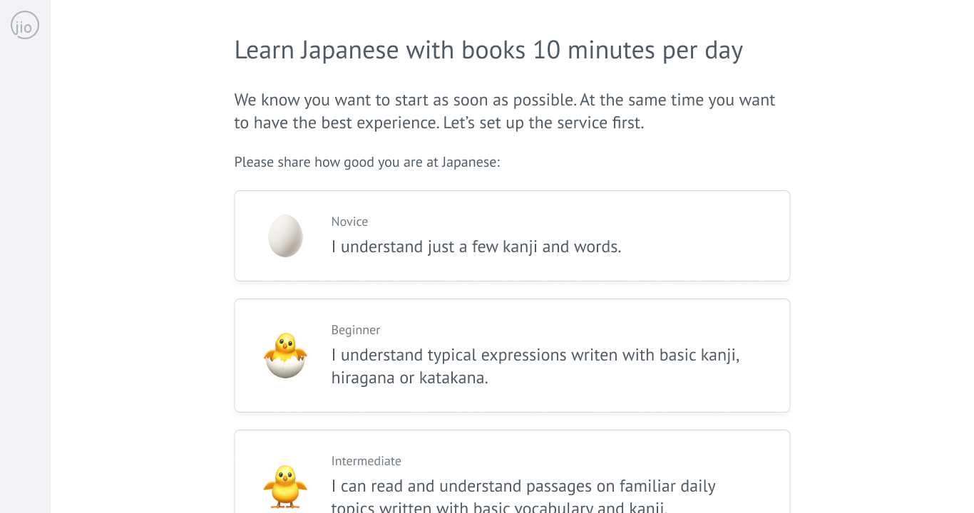
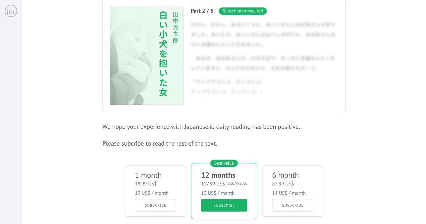
We dismissed the “Positive changes” and “Custom texts” ideas due to technical infeasibility. Instead, we conducted the “Guided daily reading” experiment. We took one simple text and manually split it into sentences, vocabulary, and grammar points. Once the user reaches the end, we ask them to pay. If they agree, we invite them to the interview.
Conclusion
Through research-driven UX, rapid experimentation, and pragmatic constraints, we gradually shifted Japanese.io into a more human, motivating learning experience, laying the foundation for its evolution from a simple reading tool into a full-fledged language-learning platform.